
December 2021
Priorities in the Primary Suite
Our philosophy of design always starts with a focus on circulation, scale, texture and our signature mix of the raw and the refined.
No place is this more important than the primary bedroom - where we believe a room should feel calm, collected, and thoughtfully arranged. We were honored to be asked to design the primary suite of Atlanta Homes & Lifestyle’s latest showhouse. We put together a room using a few flexible guidelines we follow to create the purposefully designed nocturnal utopias of our client’s dreams.
1.
Consider the scale of the room and the vibe you are trying to emulate when choosing the color.
For this suite, we had a blank canvas - an immense footprint, soaring 14’ ceilings, and ample natural light - certainly not a bad hand to be dealt. However, the room lacked the warmth and intimacy we always seek to create in a bedroom. Our goal, more often than not, is to create an environment that envelops you in a warm, serene cocoon - the perfect place to settle after a long day. We often look to darker, moodier tones to accomplish this. In this case, we chose Benjamin Moore’s Terra Mauve, which we took from floor to trim to create the base layer of the unique sanctuary we set out to create. The result scaled the room down to create the intimate sleeping quarters we enjoy. Regardless of size, consider the atmosphere you are trying to create in a room when selecting paint or wallpaper. Darker tones and wallpaper motifs can scale down large rooms or maximize small rooms to create a restful utopia.
2.
Create a base level of symmetry and then layer in interesting imbalance in accessories and finishes.
In a bedroom, a certain level of symmetry creates a calming environment, allowing the eye to rest upon similar shapes and forms on either side of the room. To accomplish this, we centered the bed on the main wall, flanked by identical windows with beautiful matching draping. Some form of bedside table holds space on either side of the bed, with lamps echoing each other. A curved sofa sits centered to the bed, with a large rectangular rug anchoring it all. Creating that base layer of soothing symmetry allows us to add our interestingly imbalanced details. We used mismatched bed side tables - one, an antique textured chest, the other a leggy, ornate table. It works because they take up similar amounts of visual space while adding interesting juxtapositions - rectangular and oval, rough and smooth, solid and airy. Taking up similar visual area while highlighting unique differences is a trademark of our work - it allows for the calming balance of symmetry while adding the interest and character of a collected home.

3.
Think of lighting as more than utilitarian - consider them illuminating art.
Considering the hours spent in the bedroom are often after the sun has gone down, lighting is critical in bathing the space with a warm glow. That being said, we have a few guidelines in terms of the types of lighting we use. Light should always come from multiple sources, often starting with the ceiling. In this room, we designed and created a spun, brass disc, that reflects the sort of warm, ambient lighting across the ceiling we desire. Overhead lighting should never be directional, as this can create harsh shadows. Next, table lamps should be used at a variety of heights to create even layers of light. We sometimes add directional lighting to highlight specific areas, such as art or reading nooks.
While the utility of lighting is obviously most important, we look at lighting as the perfect opportunity to add texture, shape, and color to a room with beautiful forms. The hero of the room is the Dixon Rye designed overhead brass disc. It does much more than add lighting - it sets the tone for the directional, but warm environment we created. It’s both polished but handmade - the perfect example of our overarching design philosophy. The table lamps, too, serve a purpose far greater than their bulbs. We varied shape - pyramid and spherical - and finish - rough and textured, shiny and smooth - to create a collected look that directs the eye around the room.
4.
Add texture and warmth through a large scale rug.
A large scale rug underfoot is almost always a requirement for our bedrooms. They add the soft warmth we look to create in our restful rooms. Typically, we want to have at least the front legs of the bed on top of the rug to keep the room feeling grounded and intentional. While the practicality of putting your feet on a plush carpet upon rising is paramount - it’s also the perfect opportunity to add pattern and texture. A rule of thumb we follow to keep rooms feeling interesting and collected is for every solid, we add a print or pattern. In this room, with our sofa and headboard both fabricated in warm solids, we decided to add a pattern to the rug that anchored them both. The beautifully handmade wool rug was woven in Afghanistan from a family owned company. The angular lines of the geometric pattern are the perfect contrast to the curves of the bed and sofa. The overall effect is a comforting and balanced mix of traditional and modern, restful and unexpected.
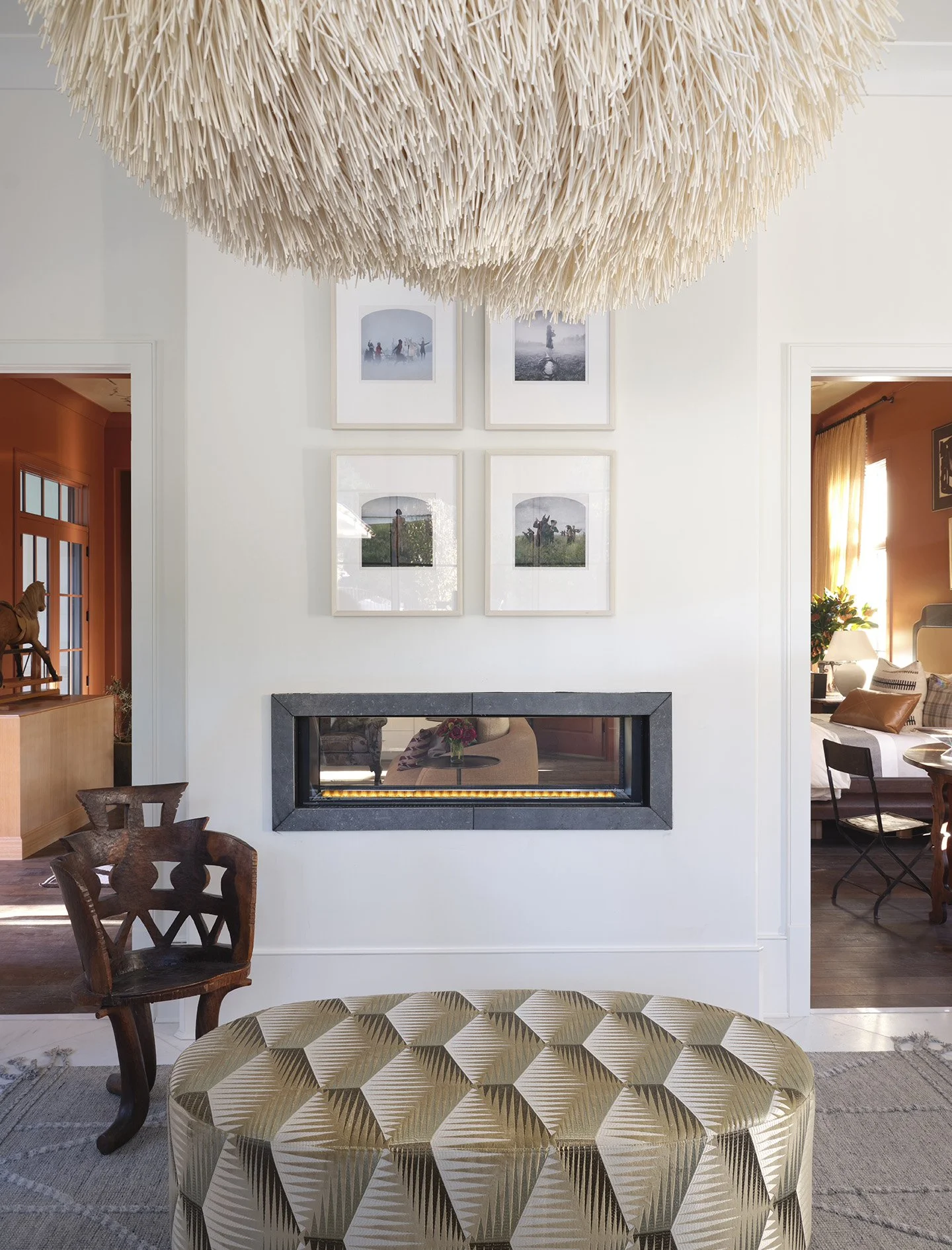
5.
Layer in interesting art in a complementary color palette.
Art is deeply personal and as such, should be tailored to your own tastes and interests. We aim for a curated and eclectic mix, especially within a gallery wall. In this room, we mixed photography, sourced from Jackson Fine Art, with painting, taxidermy, and sculptural accessories. Even within the paintings, we mixed abstract, surreal, and geometric paintings to constantly keep the eye curious and intrigued. The key to an exciting, and not overwhelming, mix is to keep the art within a complementary color palette. This is especially important in the bedroom, where our intent is to create a calming atmosphere full of texture and interest, without any sense of visual chaos. As with all “rules”, we use the term complementary loosely - aim to create the sense of a collection. Here, we played off mostly warm tones with through lines of black to keep the room cohesive.
6.
Don’t overlook window treatments.
The window treatments in a room are an essential element in pulling together a room. Luxurious fabrication adds texture and warmth while highlighting the architecture of a room. A few guidelines maximize the potential of a room. We hung our rods just below the molding, emphasizing the height of the 14 foot ceilings and drawing the eye upwards toward the unexpected hand painted detailing. Hanging the draping to fall within 1” off the floor looks luxurious and intentional - for us the closer it is to kissing the floor the better. We also extend the rod at least 6” on other side of the window, giving the window space to breathe and allowing the natural light to pour in. In this room, we had our drapes made in lined Libeco linen with Schumacher tassel trim detailing. The tone complements the color of the walls, further emphasizing the soothing cocoon we created. The tiebacks, the perfect place to add an unexpected detail, are gold snakes, only visible upon a closer inspection.
7.
As always, mix in new and antique, raw and refined - the trademark juxtapositions of Bradley Odom xx Dixon Rye.
One of the most important things, and a signature of our work, in creating a fully realized room, is the mix. We strive for the gathering of the new and the antique, the raw and the refined. This room perfectly demonstrates that philosophy and exemplifies how that eclectic collection pulls together a room. As we discussed, the lighting in the room is a perfect place to put this to good use. The four major sources of light offer a variety of shapes and textures. Starting with our in-house designed and custom made ceiling fixture, we wanted a reflective and warm, smooth disc the bounce light around the room. The smooth, spun brass perfectly contrasts with our Dumais Made table lamp. The pyramid shape, the rough matte of the stoneware construction, and the hand-rolled gridwork pattern, play off of the smooth sheen of the pendent fixture. On the other side of the bed, our Paul Scneider lamp furthers this mix. The hand glazed and dripped sphere, in a shiny clear finish, juxtaposes the other lamps in shape and color. To keep it looking intentional, match the scale of the bedside lamps as we did. Lastly, our Urban Electric accent lamp pulls in the brass from ceiling fixture, but does so in a tailored and unexpected way to complete the room.
The furnishings in the room also follow these rules. The custom-made rectangular bed is mixed with the curved Verellen sofa, the bed in a smooth suede and the sofa in a textured linen. The tailored wingback chair, upholstered in an unexpected House of Hackney pattern, is the perfect mix of playful and traditional. The bedside tables, a loose term, play with this mix as well. Our antique trunk - solid, aged, and textured - perfectly plays off our attached double demilune. The ornate legs and smooth veneer juxtaposed the rough wood of our trunk.
As you can see, our “rules” leave ample room for interpretation and creativity - as it should be with a space as personal as your home.
We find keeping these things in mind to be extremely helpful in making the design of your bedroom a more manageable and successful project. Mastering your mix - of color, tone, texture, scale, pattern, mediums - is a journey, and one that will lead you to truly perfecting the primary suite.